We were commissioned to create the brand from scratch: naming, creative territory, logo, and brand identity for a business that specializes in pollos a l’ast (rotisserie chicken) with a Mexican twist.
We aimed for a name that could be associated with a character—in this case, a chicken—linked to Mexico, but with a more sophisticated appearance to avoid aesthetic clichés.
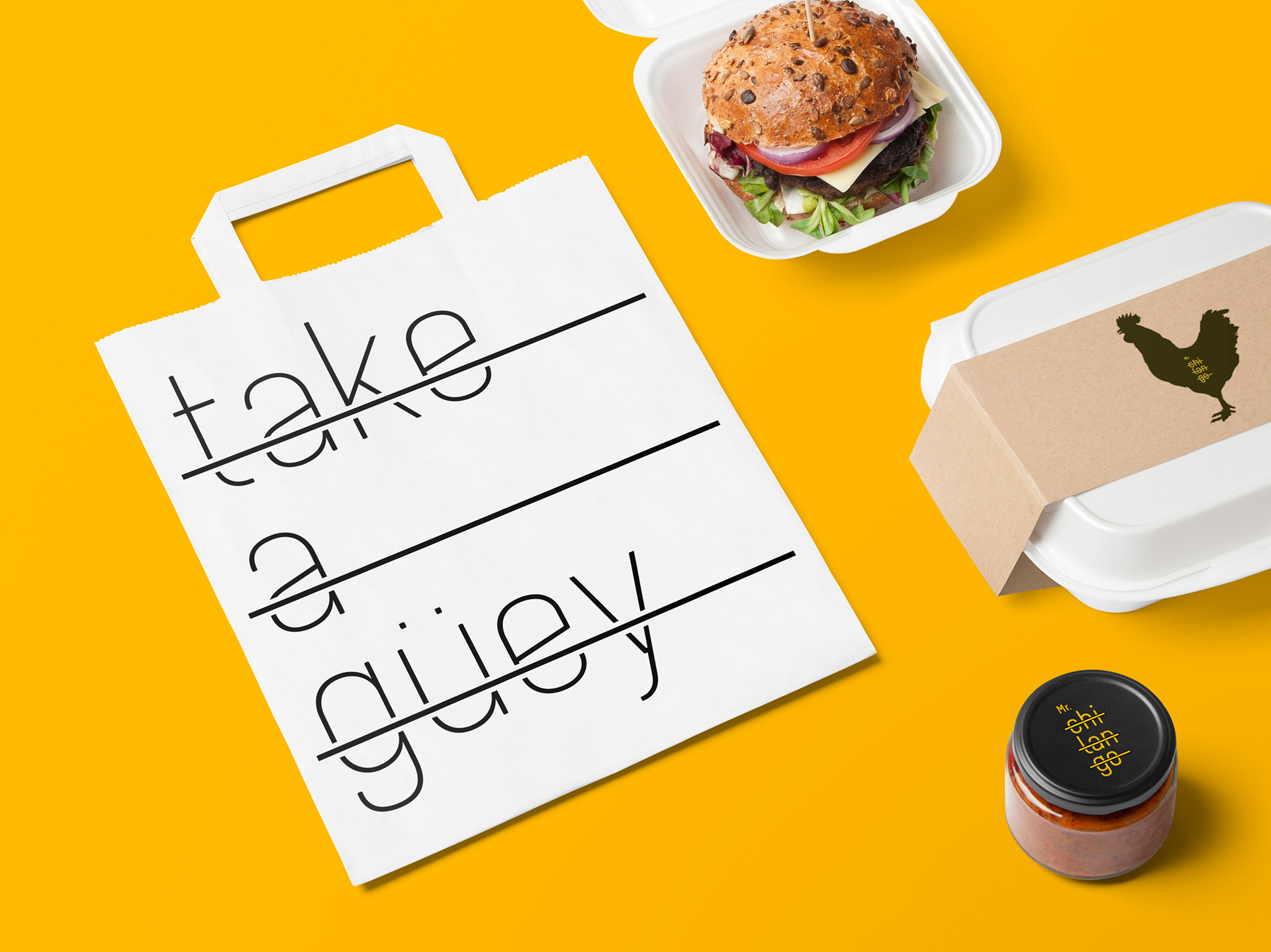
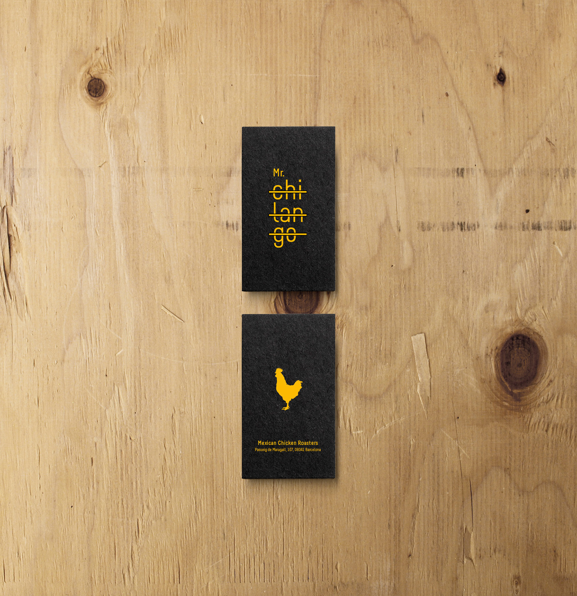
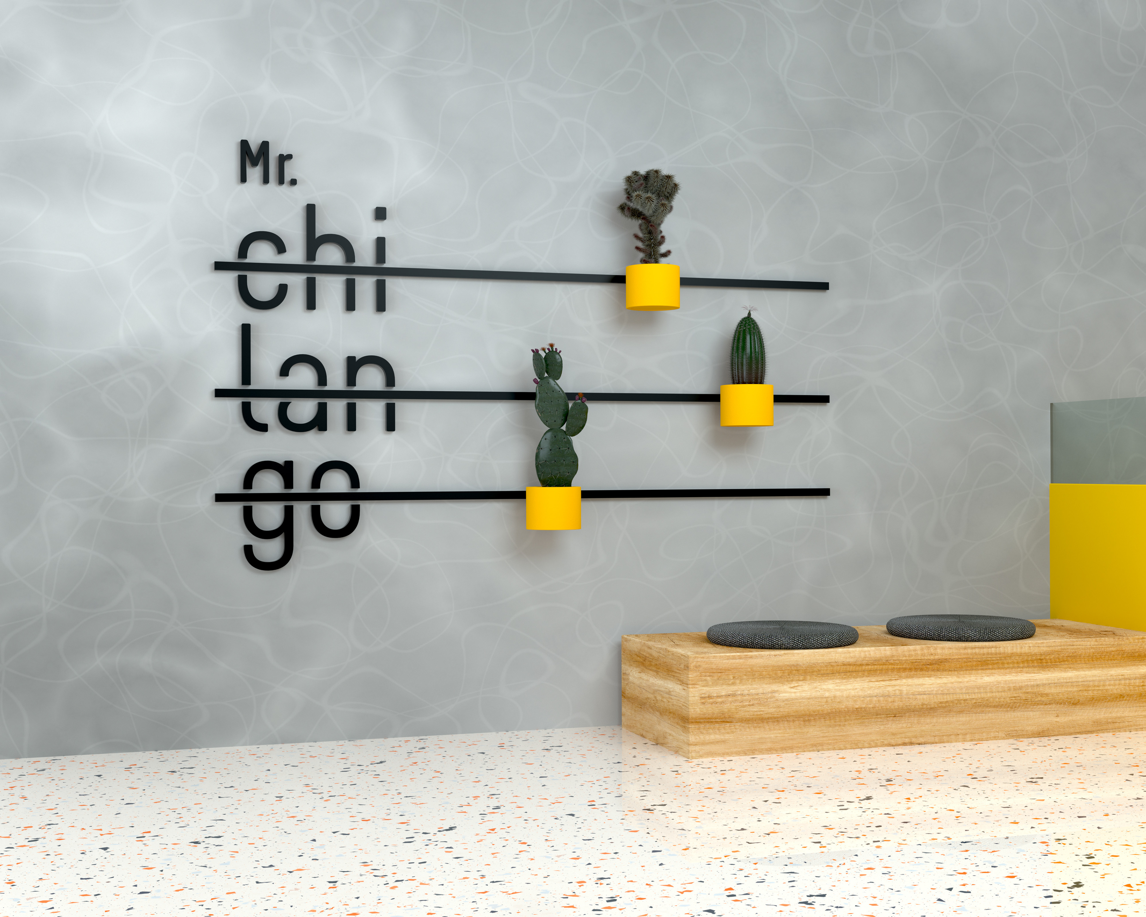
We wanted something different. So we came up with Mr. Chilango, a name that gives the brand a character-like personality and refers to the term commonly used for people from Mexico City.
Instead of developing a mascot-based concept for the visual identity, we chose to focus on the logo as the central element. This allowed us to effectively communicate the missing piece: suggesting that we specialize in pollos a l’ast.
To do so, we created a structure over the characters of the name that evoked the look of grill bars.
This resulted in a distinctive graphic element—not just for the logo itself, but one we could integrate seamlessly into any brand communication.
Client: Mr. Chilango
Creative Direction: Jorge Aijón
Design & Art Direction: Jorge Aijón
Copywriting: Montse Bernardo
Year: 2018
Let's talk!